How experienced operations leaders avoid misdiagnosis and see the full picture before proposing a fix
This article references HWC Assembly Solutions, a composite case illustration published on this site. Company name, personnel, and financial details are constructed for illustrative purposes. Not a specific client engagement.
When HWC Assembly Solutions’ EBITDA compressed from 11% to 6.8% in eighteen months, the part-time CFO brought in by the new PE ownership did exactly what a financially trained analyst is supposed to do. He ran a productivity ratio analysis and found that revenue per employee was down, while overhead as a percentage of revenue was up. His conclusion was logical: remove $680,000 in fully loaded labour cost, which was eight to twelve positions, and recover most of the margin.
The analysis was logical but incomplete. Without the other two lenses, it would have cost ten people their jobs.
What the CFO’s analysis could not see was that the financial compression had two upstream causes that a productivity ratio is structurally blind to: a flow problem in the operation, and a capacity problem in the leadership process above it. Until all three views were considered (financial, operational and leadership), the whole picture could not be understood with full clarity.
This is not a criticism of that CFO or that situation. But it’s something every manufacturing executive needs to be aware of. This is a systemic issue in which most analyses of manufacturing businesses are incomplete, leading to misdiagnosis.
Financial data is the most visible, most easily accessible and reviewed in the business, at least from a financial accounting point of view; a managerial accounting point of view may be a different story.
Operational data requires more effort, and someone has to actively go and look.
Leadership capacity data barely exist in most organizations. So when something goes wrong, the financial lens gets used first, often the only tool used, and the diagnosis reflects the limit of the tool, as it cannot capture the entire reality of the system.
An experienced manufacturing operations executive should be able to quickly pick up all three lenses, apply them in sequence, and articulate what each shows before any intervention is proposed. This article describes each lens and how to use it in practice, using the HWC case as an example.
The Three Lenses
A manufacturing business has three layers that must be read together to produce a reliable diagnosis.
1. The Financial Layer
This shows the business’s financial health. The traditional Balance Sheet, cash flow and P&L statement are good ways to look at it from a purely accounting point of view. But for us, as manufacturing executives, looking at it from a managerial accounting perspective provides far more useful information and ways to identify where the problem is originating.
2. The Operational Layer
This shows how the material and information flow through the system. This could be a simple process flow diagram or a Value Stream Map (VSM). It helps to identify where there are flow issues, how information enables or obstructs them, and opportunities for improvement. With this tool, we can determine where in the process the deviation detected in the financial lens occurs and begin identifying its root cause.
3. The Leadership Layer
This shows whether the system above the shop floor (the people who actually sequence work, resolve issues, develop the team, and maintain the improvement process) is operating within sustainable capacity limits or beyond them. This layer determines whether an operational fix holds or slowly erodes after initial success.
Most diagnoses stop at the first layer, few reach the second, but almost none address the third, and that is precisely the reason why lean turnarounds stall.
Each of these layers has a tool we can use to make it visible.
Lens One – The Financial Layer: Manufacturing Business Accounts Canvas
The standard financial reporting most manufacturing companies receive, a monthly P&L and EBITDA summary, compresses costs into categories that obscure where value is actually being lost. Labour is one line item; Overhead is another. When something goes wrong, the variance shows up as a total rather than a traceable flow.
What I call the Manufacturing Business Accounts Canvas is a visual tool that maps how costs actually move through a manufacturing operation: from raw goods inventory through work-in-process to finished goods, and then COGS. You can see what drives manufacturing overhead – indirect labour, utilities, insurance, depreciation, and rent. SG&A is in a separate box from manufacturing cost, so the contribution to margin is visible on its own.
The result is a single snapshot that allows a leadership team to see where costs are accumulating, where variances are occurring, and where opportunities for improvement exist, without having to wait for the month-end close.
At HWC, applying this lens revealed that margin compression was not coming from a single source.
- The raw material price had increased by 8 to 11% due to the recent tariffs, which affected parts from the US-based suppliers. This cost was absorbed by the business because it has fixed-price contracts with OEM customers.
- Overtime was running at 14% of total labour hours against a budgeted 4%. In Ontario, the overtime rate of 1.5x base rate kicks in after 44 hours/week. The over-the-budget wage cost from the overtime was about $100,800 per month.
- An overflow storage lease had been added at $6,200 per month to store excess inventory. Additionally, it required a dedicated person to move this inventory between facilities, which added to the indirect labour cost, which was hidden in the overhead.
- Rework related labour hours were hidden inside the direct labour line and were not tracked.
None of this was visible by just looking at the productivity ratio. The Accounts Canvas made each cost flow traceable to a source. This allowed us to make a counterproposal to the CFO’s headcount-reduction recommendation. A revenue-per-employee ratio tells you what happened. The Accounts Canvas begins to tell you where.
Lens Two – The Operational Layer: Value Stream Map
If the Accounts Canvas shows where costs are accumulating, the value stream map shows why. Most manufacturing professionals already know this tool. A VSM traces the flow of material and information through the entire production process, from order receipt to shipment, making wait times, queue times, batch sizes, and handoff points visible in a single map.
VSM reveals the specific location for the flow failures. Where is the work stalling, and WIP is building? Where is the information handoff breaking down? Which process steps are producing variation that forces rework downstream? VSM provides operational visibility to tackle these problems.
At HWC, the VSM would have identified the two specific accumulation points where financial data was recorded as cost, without identifying the location. It also makes the information flow visible.
- The first was at sub-assembly staging, where senior assemblers were pulled from planned work to expedite priority orders, disrupting everything downstream.
- The second was the rework queue, where units failing first-pass inspection were waiting for engineering disposition. With the engineer who had held most of the customer specification knowledge having resigned eight months earlier, the disposition step had fragmented: the VP of Operations was handling it when she could, at her own admission, performing at roughly 40% of the previous engineer’s pace.
The VSM also makes the information flow visible.
- At HWC, order management had no single tracking source. The status of an active order in the production system required three phone calls to determine.
- The Monday priority meeting had drifted from a 30-minute structured session with clear sequencing outputs to a 75–90 minute discussion with ambiguous results. By Wednesday, the floor was self-directing based on accumulated judgment rather than current priorities.
The VSM mapped this information failure as a broken flow, and a broken information flow is the upstream cause of the overtime that the financial analysis wrongly attributed to excess headcount.
Lens Three – The Leadership Layer: The LCE Framework
This is the lens used the least, which is precisely why we are unable to see how operational improvements erode.
A value stream map can identify the flow issues in your process. A lean team can implement standard work, reduce cycle times, and improve first-pass yield. All of which create real, tangible results. The question is whether the leadership process that enabled these improvements in the first place can operate at a sustainable capacity to protect the results produced by these tools. If the leadership process is inconsistent, the shop floor operation will not be able to sustain the results it once produced.
The LCE framework makes the leadership layer visible and engineerable. It has four interconnected components.
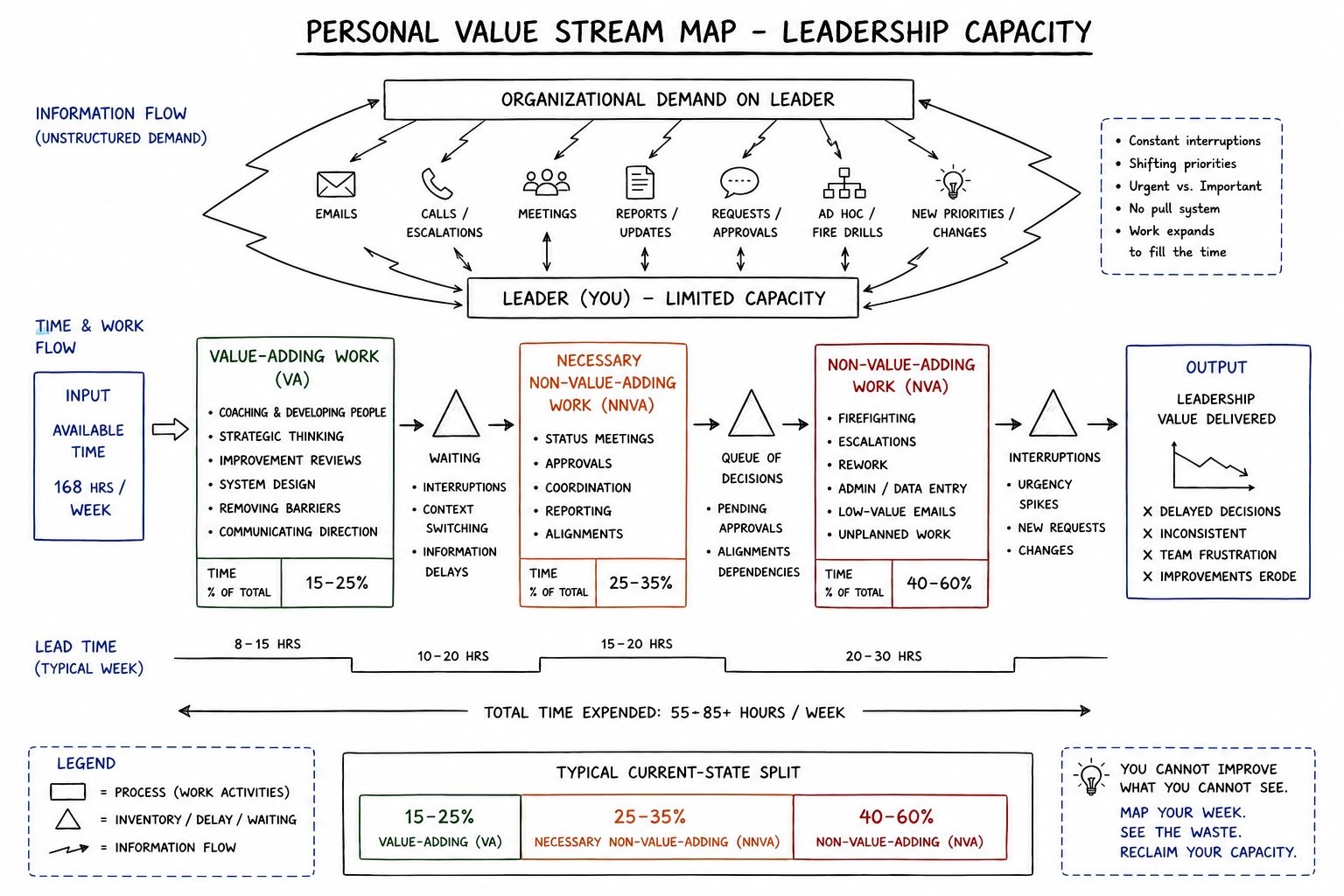
Personal Value Stream Map (Personal VSM)
This maps how a leader’s time and attention actually flow throughout the week. It tells you how much of it was planned versus reactive, strategic versus operational, what interruptions are and how they displace important work. This is the same VSM tool applied to the leader rather than the production line. It makes the leader’s own capacity visible, often for the first time, and identifies where the overburden is concentrated before it cascades to the floor.
Leader Standard Work (LSW)
This is the designed structure of how a leader allocates their capacity across the week. It is not merely a to-do list or a blocked calendar, but a system that is deliberately designed to separate the planned from the reactive, with a built-in buffer to handle the unplanned. It creates a baseline for the leadership work that makes any deviations visible and addressable.
At HWC the VP of operations had no standard work for her role. She had absorbed the departed engineer’s work, preparing ad hoc reports for the CFO and managing the PE firm’s communications on top of her own leadership responsibilities. The Personal VSM revealed the load. LSW provided the structure to recover 5 to 8 hours of strategic capacity per week, time that had not existed in her calendar for months.
Task Standard Work (TSW)
This documents all the non-negotiable routines across the different functions of the operation that must be performed to keep the business running, regardless of other demands. It is built bottom-up by the people who do the work, then pressure-tested top-down to close gaps and eliminate duplication. TSW makes the invisible visible at the system level and separates routine work from project work.
At HWC, the plant manager had been promoted into his role without a formal transition and without any documented standard for what the role required. TSW would have captured what the previous manager had been doing intuitively and made it transferable to someone doing the job for the first time.
The Recalibrated 1:1
This is a weekly maintenance window between the manager and each direct report. This helps identify any overburden before it turns into a crisis. For this meeting to be successful, the direct report should own the agenda. No one volunteers that they are overwhelmed to the person who controls their performance review if that person is also controlling the conversation. The diagnostic question that changes the dynamic is direct: What is on your plate right now that is blocking your ability to think clearly about everything else?
At HWC, the VP’s 1:1 with the plant manager had not happened in approximately three months. When it resumed in the recalibrated format, the plant manager’s workload became visible. This helped the VP to coach him to solve the problems rather than rescue him every time.
Together, these four components design the leadership process the same way standard work engineers work on the shop floor. The output is a leadership system that can sustain improvement under organizational pressure, rather than one that produces results when conditions are favourable and erodes when they are not.
Why All Three Lenses Are Required

Each lens shows something that the other two cannot see.
The Accounts Canvas shows that overtime is a significant cost variance. But it cannot tell you that overtime was used as a recovery mechanism for flow failures, which resulted from inconsistent direction by the leaders on the priority of the orders. VSM shows that the flow of the material is obstructed at the inspection and rework process. It does not explain why the engineering disposition of those orders is not completed in a timely manner. The LCE framework shows that VP is running with overburden and producing downstream variation. It does not independently quantify the cost of that variation in overtime, rework, and inventory carrying costs.
Applied together, the three lenses produce a diagnosis that is traceable from the income statement all the way back to the leadership capacity constraint that is generating the financial result. That traceability is what makes the intervention specific, the counterproposal defensible, and the outcome sustainable.
At HWC, the CFO applied one lens and proposed a solution that would have worsened the constraint. Not because the analysis was wrong. But because a productivity ratio is a single-lens view of a three-layer system. The headcount it proposed removing was, in many cases, directly downstream of the leadership-layer failures that were generating the cost pressure. Removing them would have reduced the floor’s capacity to absorb the instability that the leadership layer was producing.
The path to recovering margin at HWC back toward 10%+ EBITDA without headcount reduction required addressing the constraint at its actual source: the leadership system. The floor could not hold what the leadership system above it could not sustain. Once the leadership layer was engineered, the operational improvements held. And once the operational improvements held, the financial results followed.
Apply This to Your Own Operation
If you are a VP of Operations or a COO reading this, the three-lens diagnostic is a way to see your own business before anyone else proposes a solution.
Start with one question for each lens.
For the financial layer: can you separate your overtime variance by cause? How much is volume-driven, how much is recovery labour for flow failures, how much is planning-driven? If you cannot answer that from your current reporting, your financial lens is showing you a total without a source.
For the operational layer: where is your WIP accumulating right now, and do you know specifically why? If the answer requires three phone calls, your operational lens has a visibility gap.
For the leadership layer: open your calendar for next week and count what percentage of your available hours are already allocated before the week starts. If the answer is above 85%, you are looking at overburden.
A complete picture requires all three. Any one of them alone will point you somewhere, but not necessarily to the right place.
Vivek Naik is the founder of Leadership Capacity Engineering. LCE works with VP Operations, VP Engineering, and COOs at manufacturing companies whose lean programs are stalling — or whose best leaders are producing inconsistent results under pressure. Get started with a 30-minute diagnostic conversation. No prescription before assessment.
Contact: vivek@leadershipcapacityengineering.com | LeadershipCapacityEngineering.com